Controls
Mobile modeMobile Banking App
Senior UX leadership for a regional bank's mobile banking app · client details anonymized
A regional bank wanted its app to become how customers actually bank, the daily default, not a reluctant alternative to the branch. The obvious features were already there. The real work was finding which everyday moments mattered most, then designing them so well that mobile became the habit.
Mobile Banking App
Senior UX leadership for a regional bank's mobile banking app · client details anonymized
A regional bank wanted its app to become how customers actually bank, the daily default, not a reluctant alternative to the branch. The obvious features were already there. The real work was finding which everyday moments mattered most, then designing them so well that mobile became the habit.
The Reframe
Alignment workshops reframed the goal from shipping more features to winning the everyday moments that decide whether an app becomes a habit: checking a balance, depositing, paying. A broad mandate to modernize the app narrowed to one clear bet: own the everyday.
Prior Work Audit
Before drafting anything new, we pointed AI at everything the bank already had: past research, prior app designs, support tickets, and a wall of app-store reviews. It surfaced what customers already loved, what they complained about most, and where the everyday friction actually lived. The team's time went to the moments that moved daily engagement, not to rediscovering what the organization already knew.
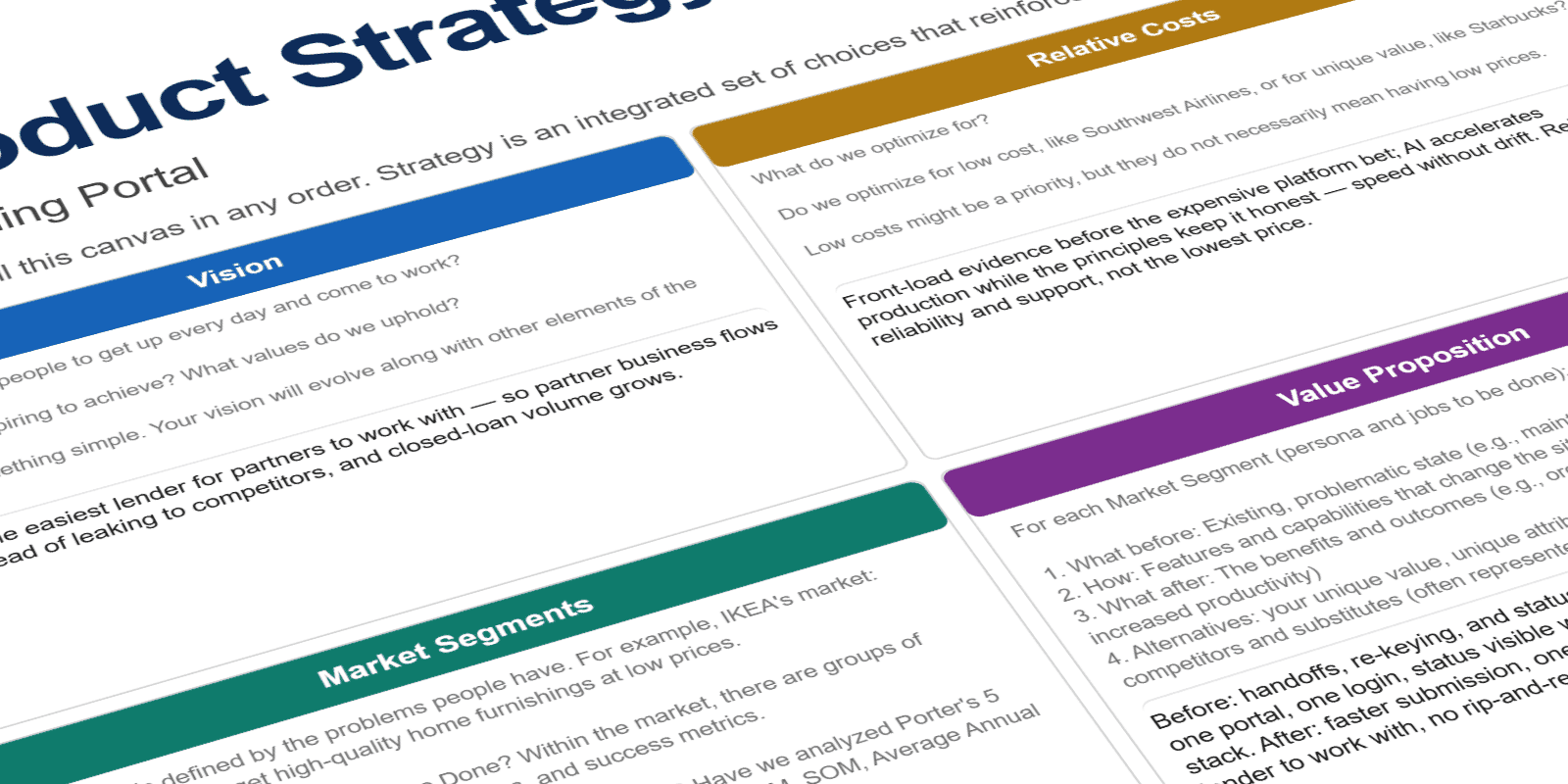
Product Strategy
The principles became capabilities, and the capabilities became a product map: how the bank's core systems fed the app the everyday moments a customer actually touched, from checking a balance to depositing a check. The strategy framed one clear bet, own the everyday and become the default way customers bank, and the sequence of releases that would prove it.
Design Principles
Working with the team, we set the product design principles up front and used them as the shared filter for every call that followed: effortless for everyday tasks, trustworthy with people's money, and fast enough to become a habit. Each trade-off, from app architecture down to pixel-level decisions, got tested against that rubric together instead of relitigated from scratch.
De-risking the Bet
Platform bets are expensive to get wrong, so the work front-loaded evidence, turning assumptions into validated insight before committing a dollar to build.
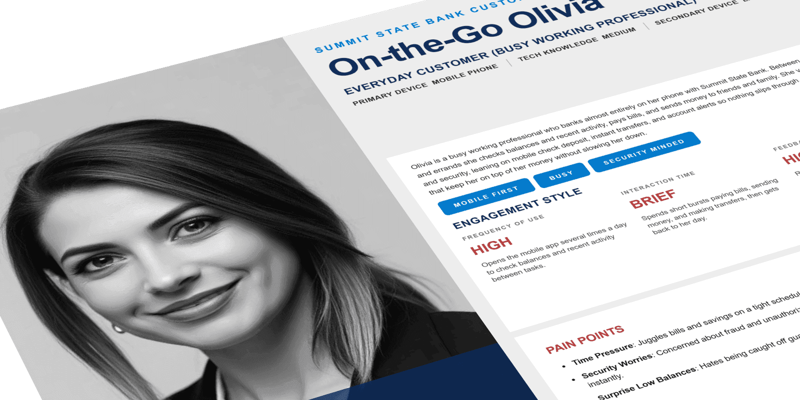
Personas
Research turned assumptions about customers into validated personas. People bank where it's easiest. Understanding who they were, how they actually used the app day to day, and what pushed them back to the branch or a competitor's app gave the team a shared picture of the user the experience had to win, not a guess about one.
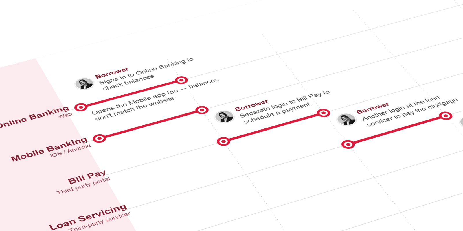
Current-State Journeys
Current-state journey maps exposed where customers lost patience: the dead ends, extra taps, and trips to the branch that the app should have absorbed. Mapping the friction made the everyday pain visible and gave the team concrete moments to design against, rather than a vague mandate to "improve the app."
Future-State Journeys
Future-state journeys showed what the same tasks looked like with the friction removed: deposit a check from the couch, see your balance before logging in, move money in a tap. Laying the two maps side by side turned the friction into a before-and-after argument stakeholders could see, and gave the principles a concrete experience to point at.
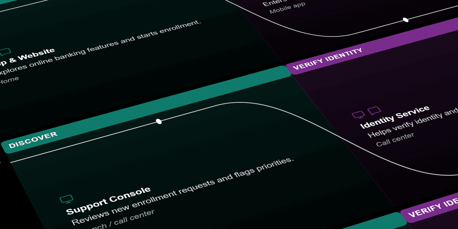
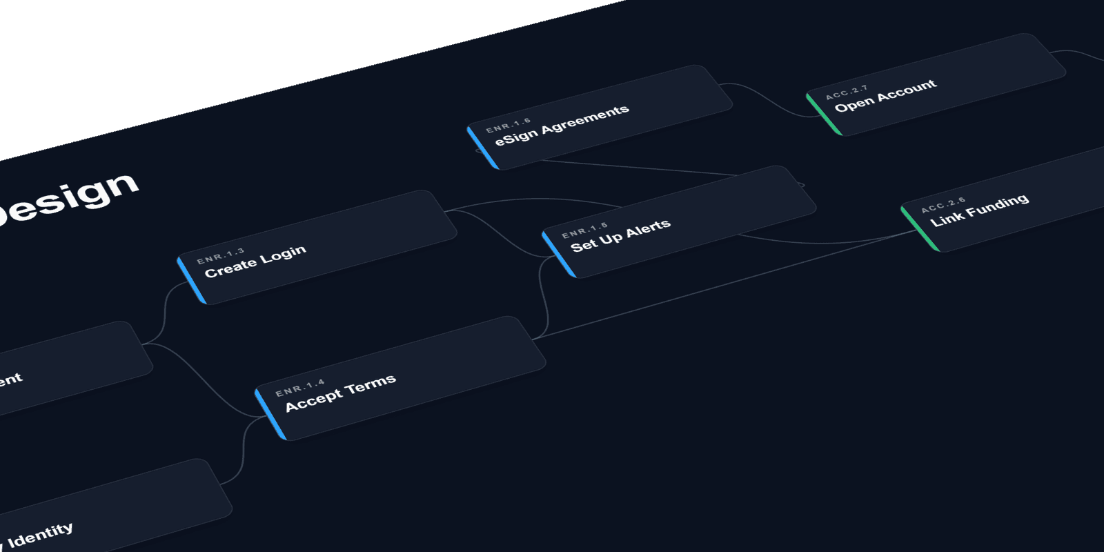
Information Architecture
The app had to put the everyday tasks one tap away (check balance, deposit, transfer, pay) instead of burying them behind menus. The IA structured accounts, payments, and quick actions into a hierarchy that matched how people actually bank, validated with customers before a single screen was designed.
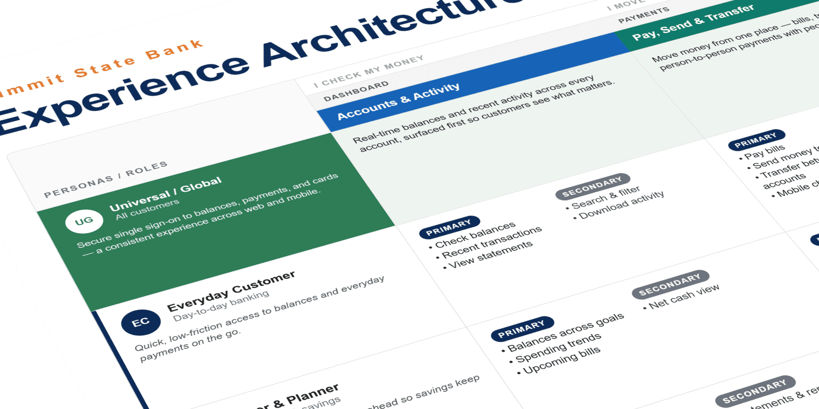
Experience Architecture
Experience architecture stress-tested the information architecture against every persona and account setup, from a first-time user with a single checking account to a power user juggling joint, savings, and business accounts. Walking each one through the structure showed where the hierarchy held and where it broke, so the IA worked for everyone before a single screen was designed.
Acceleration Without Drift
With strategy and principles set, the work turned to designing the product itself, fast but never loose. Every screen drew from one design system and got tested against the same rubric, so production could move quickly without the experience drifting from screen to screen.
Wireframes
Wireframes kept ideas cheap while the structure was still settling. Low-fidelity flows explored how customers would move through deposit, transfer, and balance views, invited critique early, and converged on a structure before visual design locked anything in.
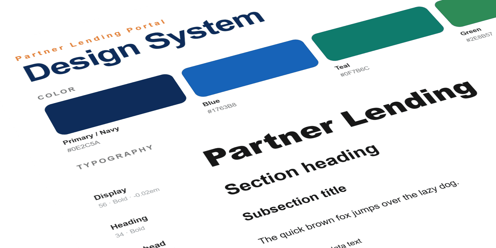
Design System
A shared token foundation came first (one color palette, one type scale, one set of rules), so every screen spoke the same visual language. Locking the foundation early is what let production stay on-brand and move fast instead of drifting screen to screen. The system became the single source of truth every new screen answered to, the engine that kept a growing product consistent.
See how the system governs AIUI / Feature Design
The strategy pointed at a handful of everyday moments. Each one got designed end to end: the fast path, the edge cases, and the small details that decide whether a feature becomes a habit.
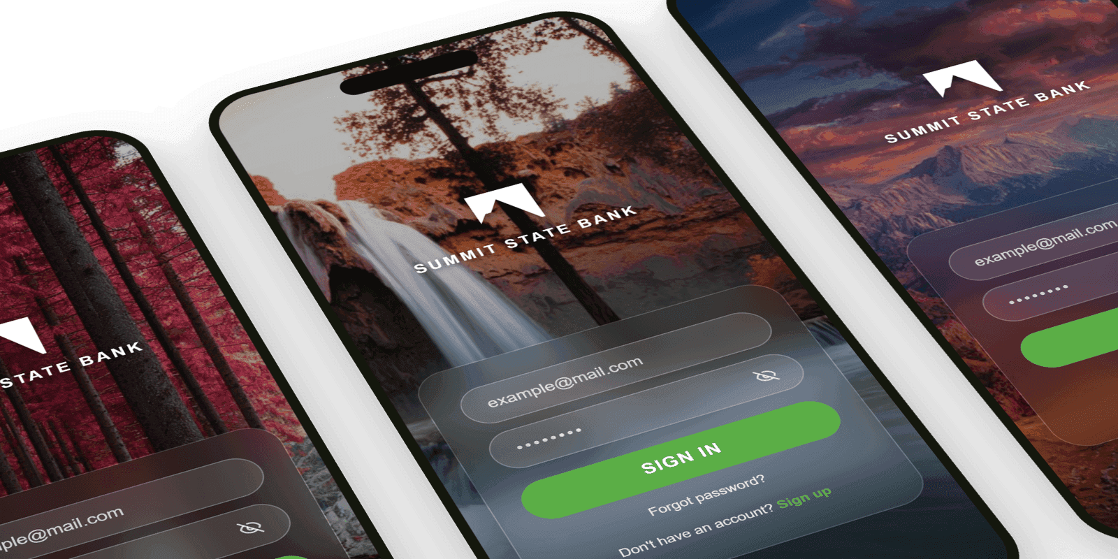
Geo-Aware Login
Location-aware sign-in recognized trusted places and devices, so the everyday open stayed fast and frictionless while security tightened where it mattered. The hero image was pulled from a bank of regional photos shot by local photographers, so the screen felt local to wherever you opened it.
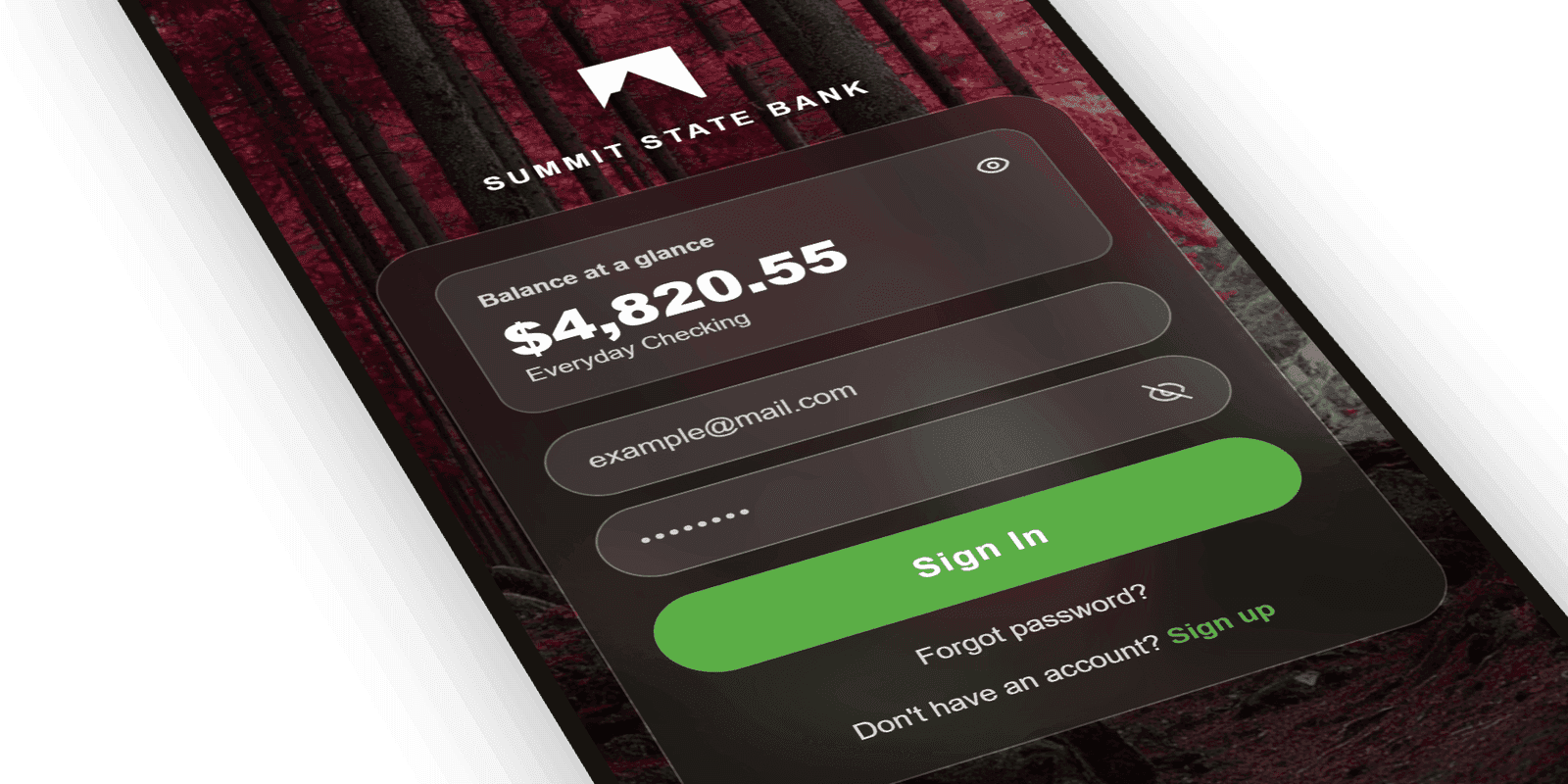
Balance at a Glance
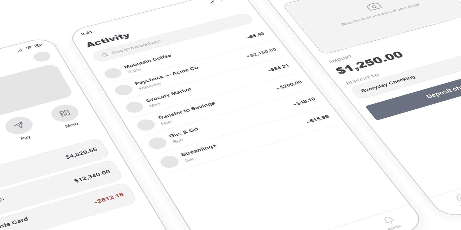
Customers could see their balance before logging in: the single most-requested everyday action, surfaced the moment the app opened.
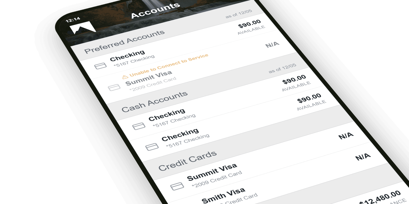
Accounts
The Accounts screen pulled every balance and recent transaction into one place, carrying the same Summit branding and green accent as the sign-in. It turned the home of the app into a clear, scannable picture of where a customer's money actually was.
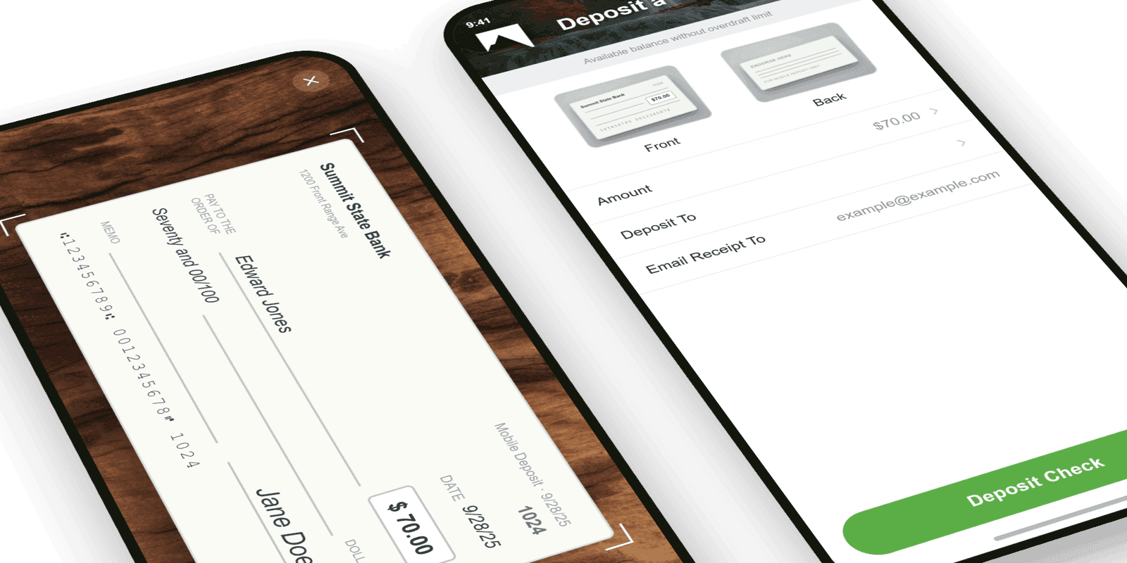
Mobile Check Deposit
Snap, confirm, done. The deposit flow stripped a multi-step chore down to a few taps with instant confirmation, one of the highest-volume actions in the app.
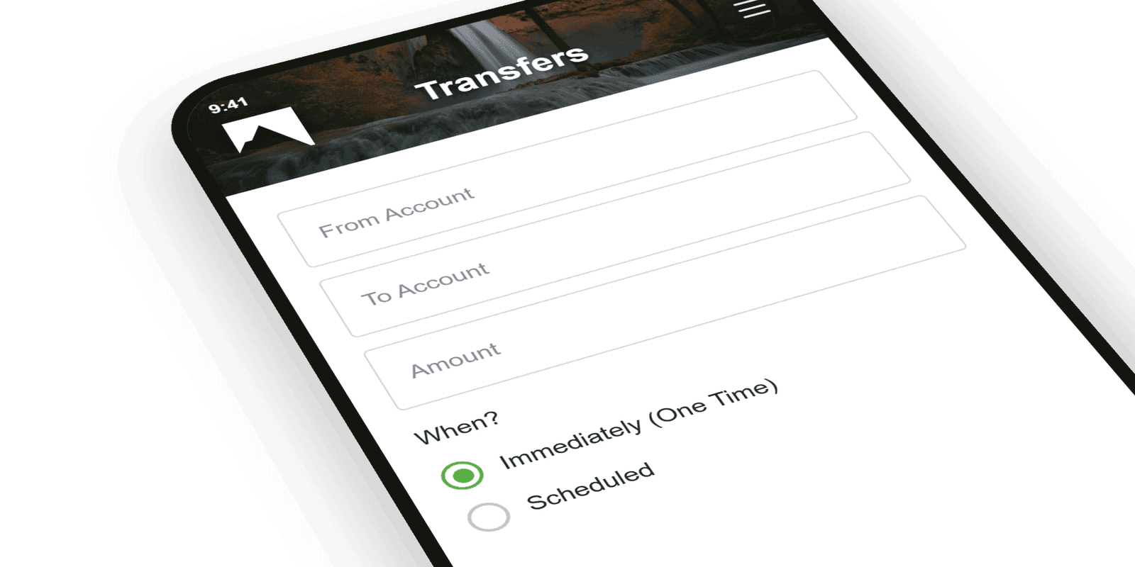
Quick Transfers
Moving money between accounts and to people took a tap from the home screen, with recent recipients ready and amounts pre-validated.
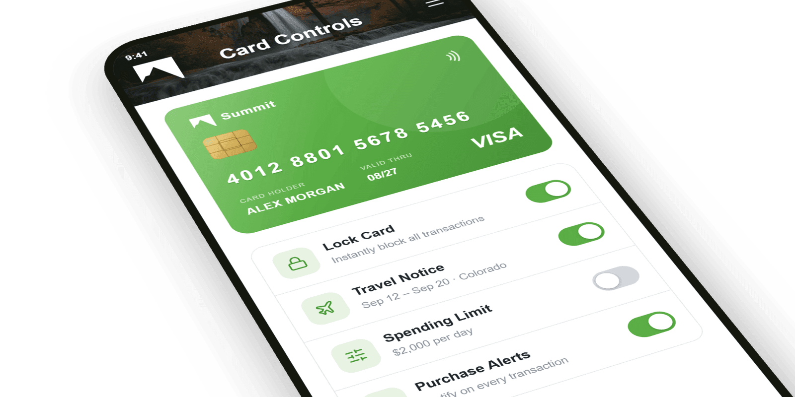
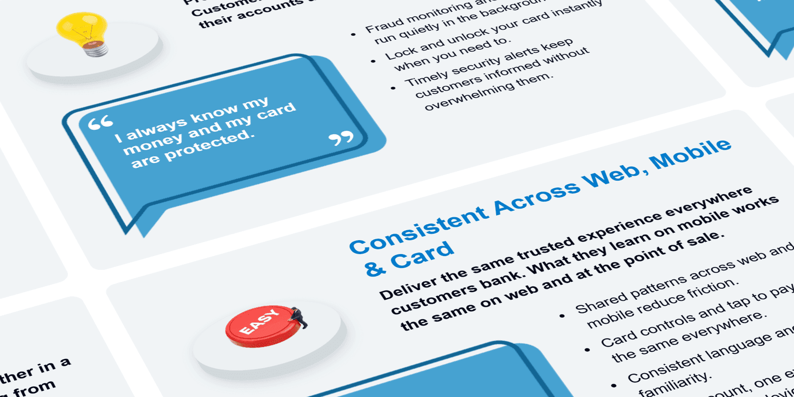
Card Controls
Lock a lost card, set travel notices, and manage limits in-app, turning an anxious call to the branch into a five-second self-serve action.
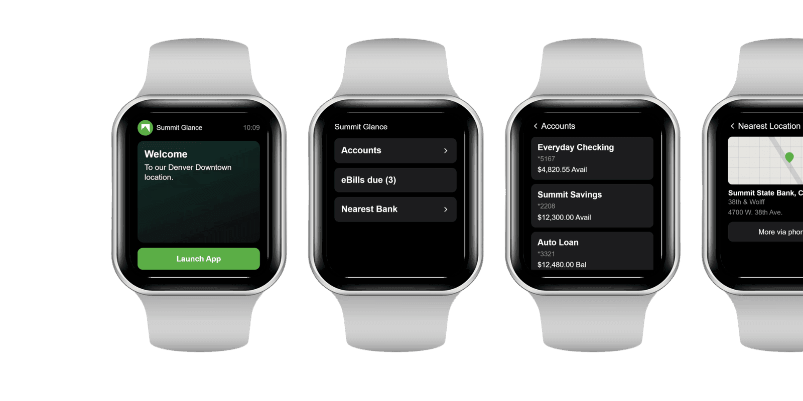
Watch App
The everyday glance moved to the wrist: balance at a raise of the arm, plus quick access to accounts, the nearest location, and eBills. Designed for the moments a customer wanted an answer without reaching for their phone.
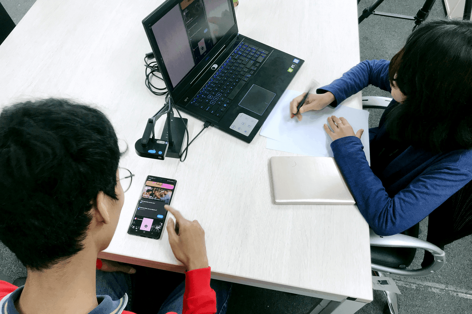
Usability Testing
Before anything shipped, the core flows went in front of real customers in moderated sessions. Watching people actually use deposit, transfer, and balance, not describe them, surfaced the friction no internal review caught, and every fix was re-tested rather than assumed. Priority reflected what tripped users up, not what the team guessed.
System Design
System design mapped how the app connected to the bank's core banking systems underneath. Each action a customer took (depositing a check, scheduling a transfer, updating a profile) automatically triggered the right downstream processing and account updates, so what people did in the app and what happened in the back office stayed in lockstep instead of waiting on manual handoffs.
Outcome
That discipline shipped an app customers actually made part of their day, proven not in a deck but in the numbers below.
Shipped Results
Selected Work
More case studies
Other product design leadership work across financial services and commerce.
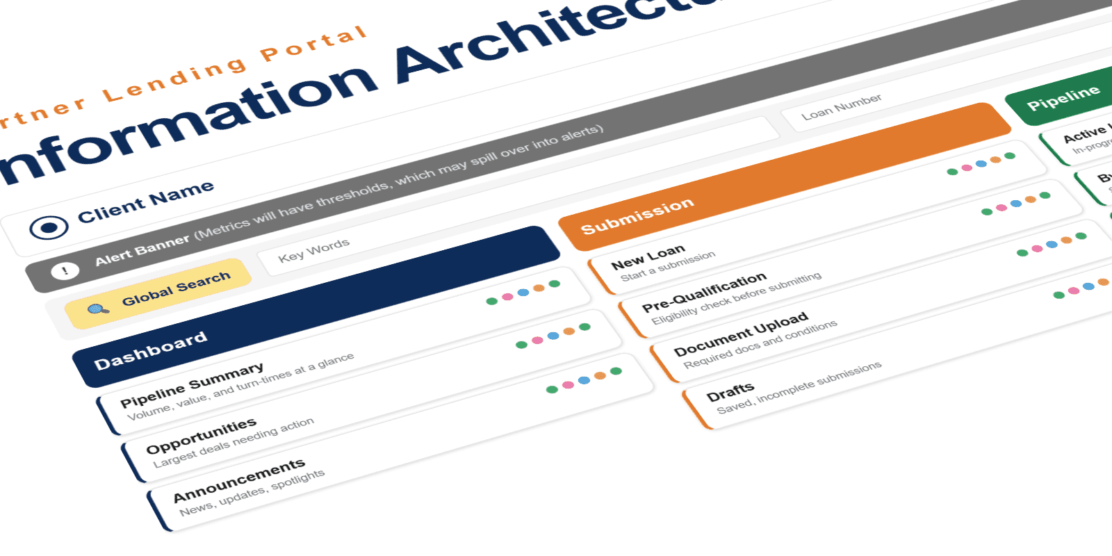
Loan solution
Led the design of an AI-powered loan solution that automated the manual, repetitive work behind every loan: payment handling, status tracking, and exception triage. Directed the experience for both internal teams and borrowers, pairing intelligent automation with clear human oversight so staff stayed in control of the decisions that mattered. The result removed operational bottlenecks and let the team redirect effort toward higher-value work.
Marketplace commerce app
Led the design of a mobile commerce app for a major online marketplace on an emerging mobile platform. Worked within the platform's native design language while preserving the marketplace's core buying and selling flows (search, listings, bidding, checkout) adapted to a new form factor and interaction model.